David King, Logos, and the Messages in Underground Graphic Design
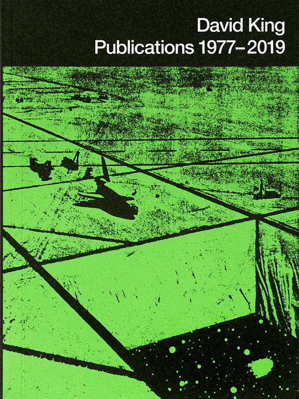
A little over a month ago, Colpa Press and the San Francisco Center for the Book put out a collection of David King’s designs, Publications 1977-2019, in tandem with the organization’s exhibition of his art. Best known for designing the Crass symbol, David King was a graphic designer and musician whose work defined the New York no wave scene, creating designs for venues such as Danceteria, the Peppermint Lounge, and Pravda. I’ve always been intrigued by graphic design within underground spaces, which share a strange unity in their aesthetics, an uncanny conformity within a subversive space. Further, even the idea of an anarcho-punk band having a logo feels like an underground co-optation of a mass marketing strategy. Ideas of branding and image are flipped on their heads for the purposes of underground activities. This week, I thought about signs, meaning, and the underground. What is conveyed through underground graphic design found in logos, symbols, posters, pins, stickers, etc.?

Throughout my lifetime, I’ve been transfixed by logos. I have a vivid memory of seeing the updated Pepsi logo in 2008, unveiled to me in the aisles of a local IGA. I scoffed at what I viewed as a hideous redesign, not compelled by their use of lowercase font, uneven stripes, all in a faux futuristic luster. A few years later, I played a game on my phone that would strip logos of obvious identifying characteristics, requiring the player to guess what the logo was. As I was reflecting on this topic of underground graphic design, memories of this game popped in my head for the first time in ages. The underlying message of the game reinforces that we have the ability to recognize meaning in these corporate symbols without words, their messages as emblazoned in our minds as a stop sign’s. If Pepsi can convey meaning to me simply through design, what does the underground say?
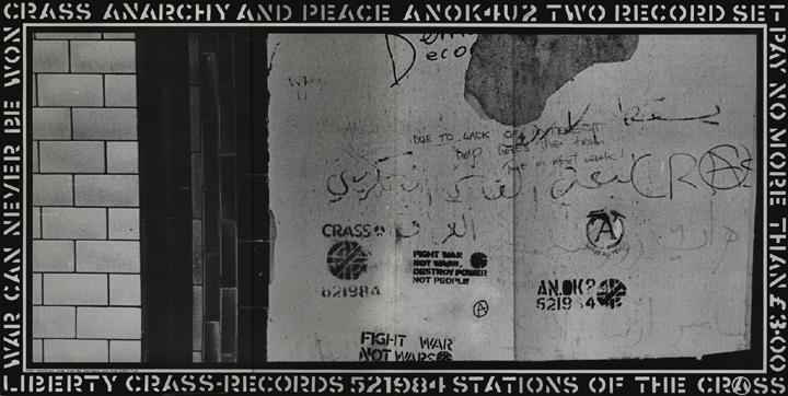
In articles about David King, there is a noticeable emphasis on symbols and meaning when discussing his designs, especially related to the Crass symbol. The writer Steven Heller shared an essay upon David King’s passing in 2019, recalling his experience corresponding with the artist to prepare a foreword for his book, David King Stencils: Past, Present and Crass. King told Heller to “focus on the power of the symbol” and to “downplay the band itself, to the extent that it’s possible to separate the band from its symbol.” In many ways, this impulse makes sense. The symbol was not even created for the band directly, instead initially designed by King for a pamphlet titled, “Christ’s Reality Asylum,” which captured a speech Crass’ Penny Rimbaud gave about the oppressive coalescence of British church and state. The design, which drew upon influences of the peace symbol (which originated as the Campaign for Nuclear Disarmament logo), King would eventually call it a “peace symbol for punks” after Crass adopted the symbol as their own. Heller’s article goes into even more detail about the layers upon layers of meanings that came before King’s design and within the usage of the Crass logo afterwards. This one design proves how much weight can be carried across time within a handful of symbols.

As I said earlier, there is something invigorating about a band like Crass having a logo, taking on a tactic of consumerism to represent their anticapitalist positions. Like Sam Lefebvre writes in his Consequence essay, “Not Just Another Cheap Logo: The Story of Crass and David King,” “The Crass symbol itself appropriates images of power to dismantle them.” Aspiring to be an artist from a young age, King faced the weight of pursuing a life of art under the constraints of consumerism since the beginning. His school counselor told him, “Oh I don’t think there are any jobs for artists, but I have this pamphlet…this says commercial art. Maybe that’s art you can get paid for.”
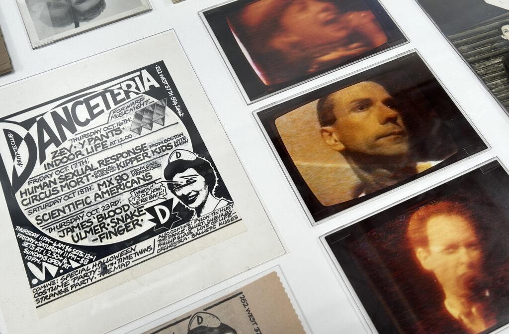
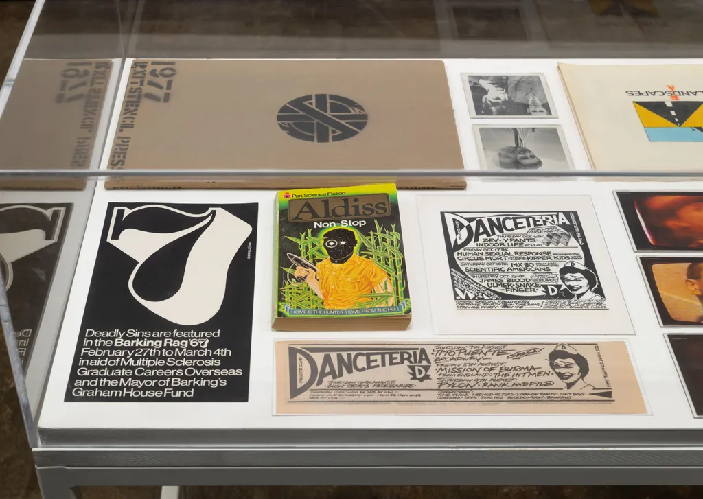
King’s work would eventually find a home within the underground, especially in New York’s no wave scene once King moved to the city in 1977. The artist found expression not only through design, but also through his band with Rhys Chatham, Arsenal. His designs would provide visual identity for significant no wave clubs like Danceteria. Looking at some of these designs, I can feel his influence palpably to this day along with contemporaries like Raymond Pettibon: the stark monochromatic color schemes, angular patterns, block fonts, the bold minimalism. His art directly reflected the music coming out of the no wave scene, music equally as angular and minimal.

Nowadays, I see this style crop up in contemporary underground designs I encounter, along with influences from zine culture reflecting the aesthetics of Xerox machines and collage. What do these aesthetics symbolize, what do they convey without using a single word? The artist Barry McGee stated for David King Stencils that “David’s iconic symbols were a badge of authenticity in the underground scenes across the globe in the pre-internet era, recognizable at 65mph on the back of a squatter punk meandering down an alleyway at four in the morning.” I also think current underground design aesthetics symbolize authenticity, made even more potent in the Internet and artificial intelligence age when the idea of hand-making a collage or using a Xerox machine feel like countercultural methods for creating and disseminating art when Photoshop and Instagram are sitting right there. Choosing this path for design (or at least making it look like one did) signifies subversion of the norm quicker than any words could.
However, I have to wonder where the line is between a shared design history and identity in the underground, versus a gradual descent into stagnation and uniformity. While I love this commonly shared underground design style and all it symbolizes, I also hope we have our own innovative figures like David King who are pushing the envelope within the underground, finding fresh ways to convey subversive attitudes in step with history while looking to the future, maybe even communicated with one symbol.
– Hannah Blanchette
January 19, 2025 | Blog